Heading in the right direction
Custom avatars for the team
Every artist wants to make work that people care about and it’s kind of hard not to care if it’s a painting of you. There is something special about having someone draw you, picking up on the nuances and details that the person themselves may have missed or overlooked.
Drawing has always been something I have done, even as a small kid, and one of the most satisfying things to draw has always been my friends and family. The satisfaction of capturing a person you care about and to see their appreciation is one of the most joy-filled moments I have had the privilege of experiencing.
I have spent just over a decade working at Hatchd, that's close to 18,240 hours. After that amount of time, the team feels like family to me. I have drawn a few people from work in my free time over the years and have always dreamed doing illustrations of everyone. But creating portraits of people, regardless of format takes time and I also wanted to explore other subjects during my free time drawing. So the dream never had much chance.
Until an opportunity arose at work where we needed to liven up our internal brand.
It started with an upgrade to Our Presentation decks.
Often in decks and presentations we need a headshot of a team member when representing their role in the product team. We used to have a preferred photography style but it's hard to keep it consistent as the team evolves. Location and lighting changes over time and for long standing Hatchd team members, they're just captured in one snapshot in time.
This section just seemed a little stale despite our pretty faces, it was just like any other company's profile pages. It needed something new, fresh and unique. This was my opportunity to shake things up and take the team headshots to the next level, designer-style.
My illustration style has progressed and morphed over the years and has organically become part of the Hatchd brand through creation of assets. So I floated the idea of drawing everyone to the leadership team and they liked the idea.
The main concern was time. I also had my own reservations like capturing the likeness of each individual and keeping the illustration style consistent.
I had to be clever about this, I couldn’t spend a day drawing each person so I looked for ways to be efficient with time, but avoid compromising a quality outcome. I looked at NFT projects where there was a consistent style across characters and a way in which I could simplify my style without losing the essence of the person. I wanted them to be stylised, have a consistent visual identity and be something people could use in more than one way.
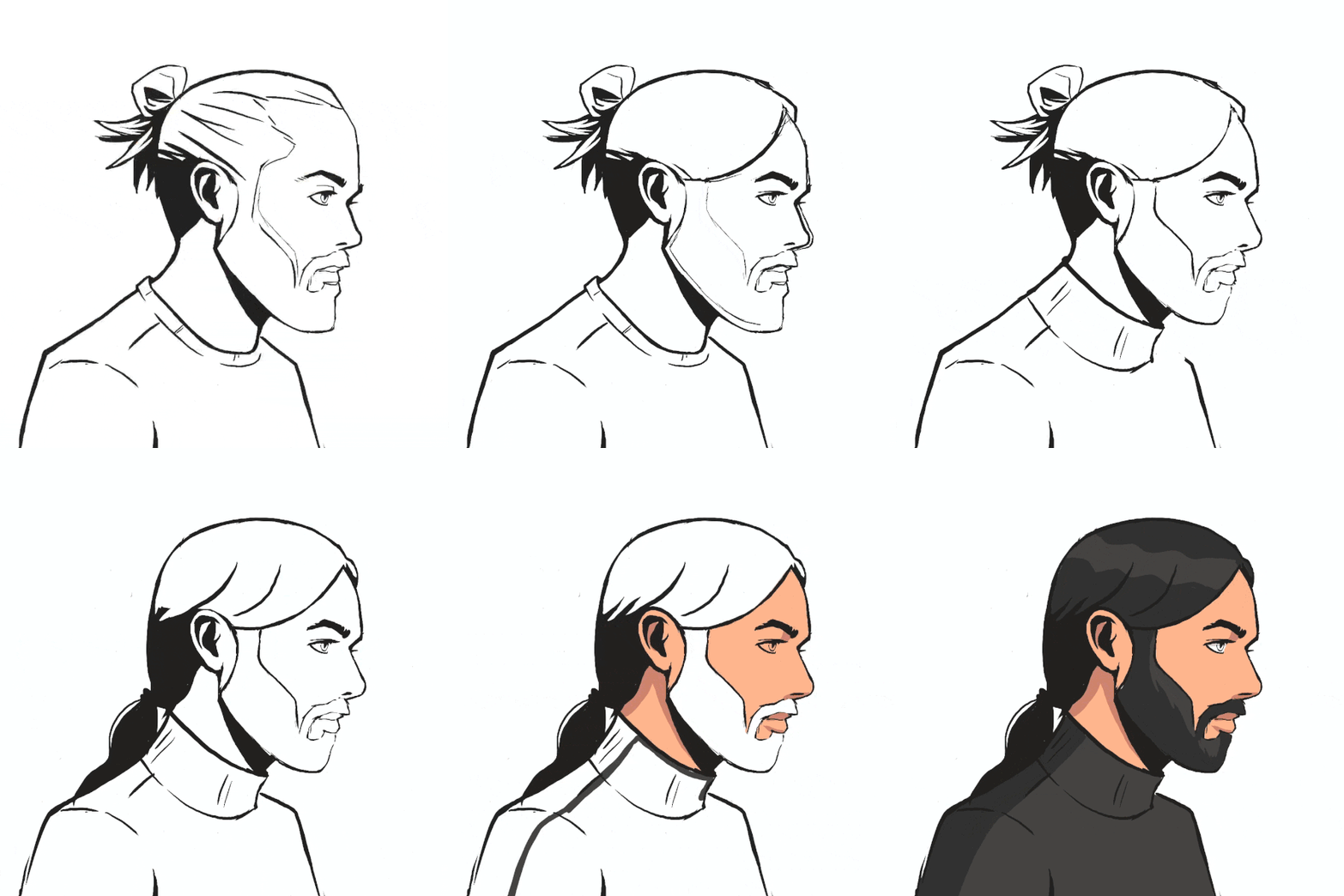
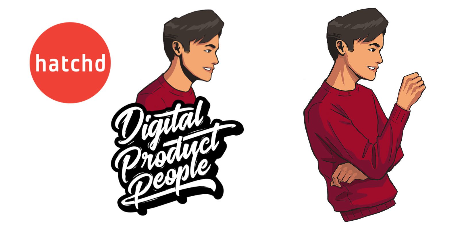
It really all started to kick off with a blog post illustration I did for Ed. I decided to use this as my test case for style. So I drew Ed side on and stylised, simplifying the details to help reduce the need for accuracy and, as a result, the effort required. Positioning the illustration side on really helped with reducing the details I needed to draw.
This first proof of concept really helped shape the style I was after but it still took longer than we ideally could spend on internal headshots. Rolling out illustrations to 40+ team members meant more efficiencies needed to be gained.
Adding in a torso and hands definitely increased time taken and these were more nice to haves.
The Minimal Viable Product (MVP) was really the person’s head. As we express ourselves through our clothing I didn't want to totally remove the body, so for the next person I drew them cropped right back to head and a bit of shoulder. I chose to draw Anna (one of our founders and directors) for this. I felt I had achieved the right kind of balance. I then used Anna’s headshot as a design pattern to illustrate the rest of the team. This helped keep consistency, scale and style.
Time Lapse video of the creation of multiple headshots being created one after another
As I was rolling these out I was getting great feedback from the team, they loved them and felt like I was capturing their vibe so well. They started changing their Slack and email profile pics to their illustrated avatar with some even adding their own colourful background to add some extra personality. It was great to see this organic uptake from the team as the ultimate satisfaction for an artist is your work being appreciated, shared and shown to others.
I was also becoming more efficient at creating these avatars. Once clients had seen our headshots on Slack and via email, we even received requests from them seeking their own team’s headshot illustrations.
Joint proposals lead to even more illustrations
We frequently put forward proposals in a collaborative team approach with our sister company Adapptor. It just so happened that one of these occurred shortly after I had finished the 22 Hatchd headshots. Marc, co-founder of Hatchd and founder of Adapptor, asked me to immortalize the full team in my illustration style. 22 avatars would soon turn into 48. At this point I had determined a system to ensure efficiency but also allow for capturing the essence of individuals.
This systematic process required the individual to capture a side profile photo of themselves as a reference. Seems straightforward, but let’s remember we are dealing with human elements. Even side profile photos can take a range of selfies to get the right one.
Using the image as a reference I would overlay a previous illustration to help guide the proportion and placement of features. With this reference on my laptop screen, I got to work drawing out the illustration on my iPad.
Since then we have incorporated our headshots on to our website, made them our email signatures and avatars across our collaboration tools like Slack and Gmail. We have even used them to represent us in decks and proposals, giving a point of difference to clients and they tend to be a talking point. I have even had the chance to extend the illustrations for some blog post assets as follows:
Jerry Email signature and extended illustration for blog post.
I like to illustrate in my free time and the approach to this project has really influenced my style for this year in my personal work.
I was slowly getting more realistic in my digital paintings just to capture someone's likeness where I would go too over the top in detail in some areas and was finding it hard to keep a consistent quality across other areas. And It was taking me longer and longer to finish off a lot of details. In some cases, I was even tempted not to complete some illustrations due to the time I was investing in them. But, by scaling back the detail and capturing the most important characteristics of a person has really sped up my process and made the quality across the illustration easier to balance.
Plus I'm having more fun illustrating in this style!


