Atomic design systems
Hatchd has been around for almost ten years now and I have been on the journey with them for nearly 9 of those years. It’s almost a totally different company now to what it was back when I started. It was a “digital agency” back then and the type of work was on a much smaller scale, we would create something and that would be it. We didn't go back, iterate and evolve. Since then we’ve evolved into a full blown software design and development business. We are not creating one off bespoke pieces of work that live for a couple years before being replaced, we need to think further into the future and design something that can scale continuously with the product, just as the infrastructure and technology scales.
So we had to shift the way we think about design. Not only does it need to scale, it also needs to be constructed in a way that can evolve and change with ease and is accessible by the whole team, designers and developers alike.
In addition to a new way of thinking, we had to consider changes to our tooling. We decided to move to a live design platform that supports collaboration, in our specific case this meant moving from Sketch to Figma. This has given us a live and accessible system better supporting our atomic design approach and enabling us to build out a dynamic design system. A living library to unite the whole team with a single source of truth.
But what exactly is atomic design and how is it used to create a design system?
What is Atomic Design?
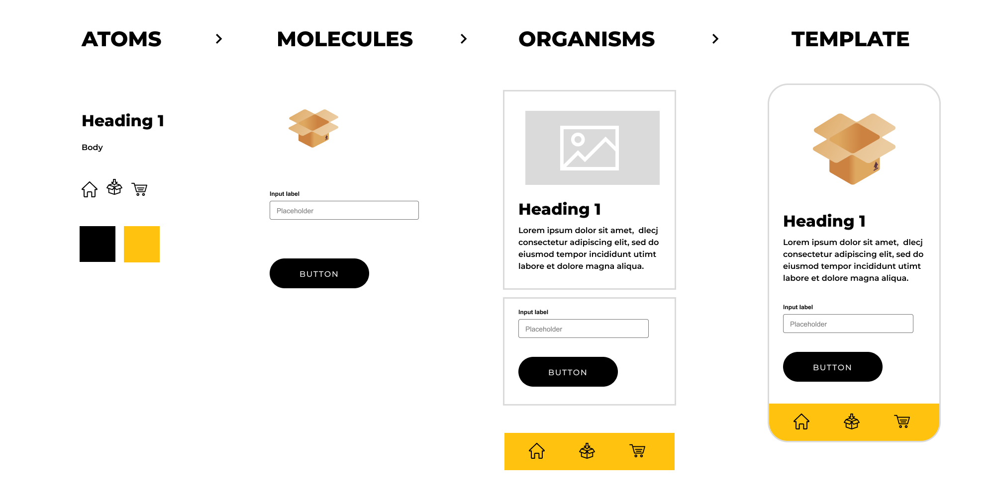
Atomic Design is a methodology inspired by chemistry (originally created by Brand Frost). Just like how all matter is made out of atoms that combine to form molecules, which then make up more complex organisms.
How we categorise these in a UI world:
Atoms are the foundational building blocks eg. Icons, Colours, Typeface styles…
Molecules are simple groups of UI elements eg. Buttons, Dropdowns, Alerts…
Organisms are more complex components that form sections of an interface. eg. Navigation, footer, card modules…
By breaking down an interface to its atomic elements we can see how those elements combine together to create a reusable UI kit.
Atomic design can take some time to build in the beginning, but is well worth it in the long run. By setting up all the reusable elements upfront it makes rolling out page templates a much faster process and is the most effective way to build a design system.
So what’s a design system?
A design system is described by Invision as “ A collection of reusable components, guided by clear standards, that can be assembled together to build any number of applications.”
According to Emmet Connolly, director of product design at Intercom, “… most Design Systems are really just Pattern Libraries: a big box of UI Lego pieces that can be assembled in near-infinite ways. All the pieces may be consistent, but that doesn’t mean the assembled results will be. Your product is more than just a pile of reusable UI elements. It has structure and meaning. It’s not a generic web page, it’s the embodiment of a system of concepts.”
Design systems bring order to a product by providing a shared language and understanding among team members. It's a single source of truth for clarity and can be referred back to at any time to make sure that what’s being created is consistent. This makes delivery work more efficient as there is less handover as everything is catalogued with clear rules attached.
Design systems aren't needed for all products but are very useful if the business intends to work on a product for a long period of time as it future proofs the UI. A good design system is living and ever evolving, adapting and constantly iterated on, serving an ecosystem that is transparent across the team.
How to implement a design system?
1. Visual Audit
A design audit is an analysis of all the visual elements used by a company. It’s performed to make sure that the brand is expressing itself consistently across all channels. Reviewing every single branding collateral the company is creating and looking for inconsistencies, flaws or wrong designs in use against the brand direction.
2. Choose the tools
There are a few tools to use when building the design system and you will likely need to use more than one. One to build the ui components like Sketch or Figma and another to host and document the components like Frontify, Zeroheight or a custom build. It's important to find something that the whole team can easily access and use as this will be the single source of truth.
3. Create the visual design language
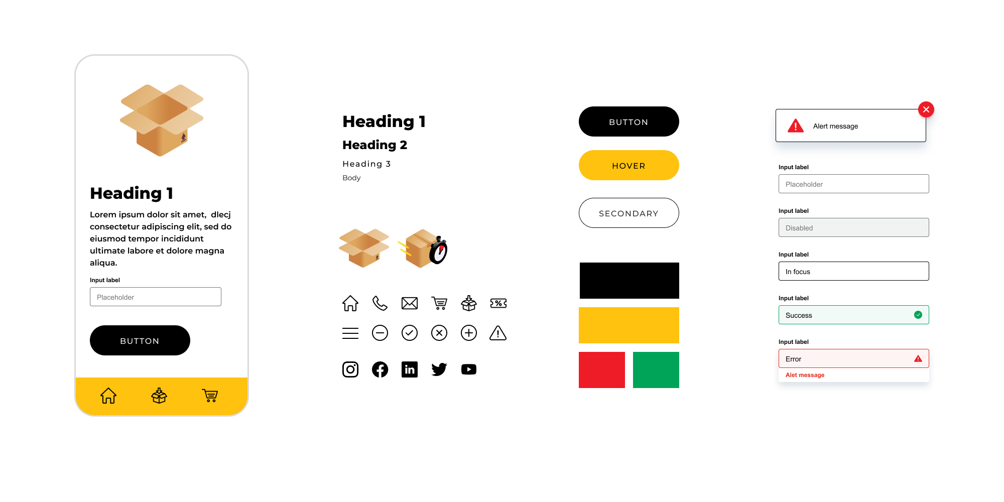
This includes the Atomic design approach design system as well as other things like imagery and tone of voice if needed.
4. Create a Documented UI/Pattern library.
Document what each component is and when to use it.
5. Establish Governance
When the design system is missing a component or the components don't fulfil all requirements needed, your team can add, expand and maintain the design system.
In conclusion
While it seems like a large amount of work up front remember that an Atomic design system has great value to the product. It future proofs the UI by having a shared language where designers and developers can communicate to build a product that keeps things consistent, flexible and is easily scalable. Ultimately saving time and cost down the line as it reduces the time figuring out what UI to use and a helpful tool when onboarding new team members.
References
https://atomicdesign.bradfrost.com/chapter-2/
https://bradfrost.com/blog/post/atomic-web-design/
https://www.invisionapp.com/inside-design/guide-to-design-systems/


